Naming & Branding - Identidade Visual | Ano: 2026 | Machá

🇧🇷
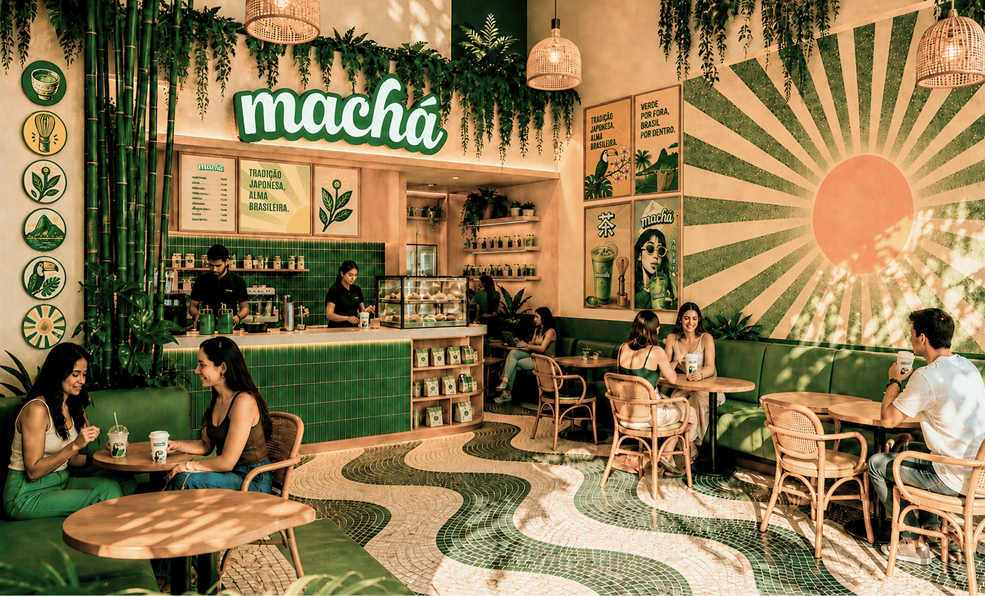
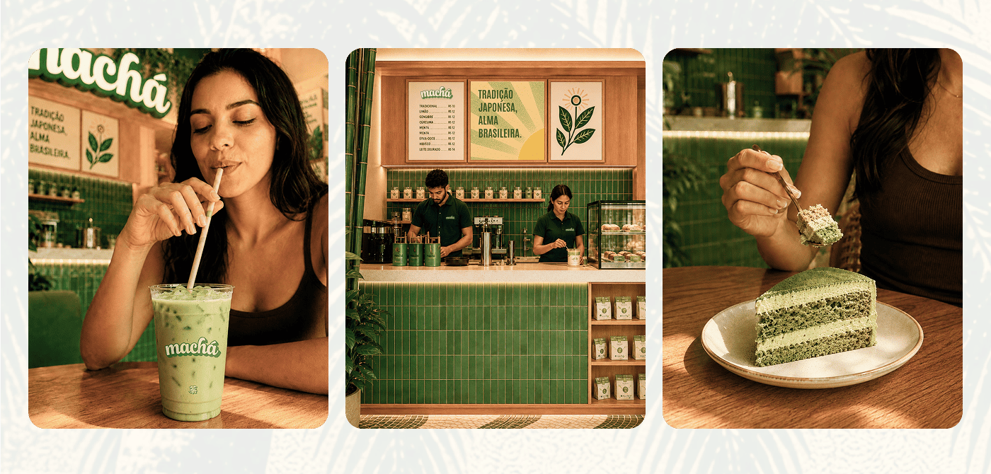
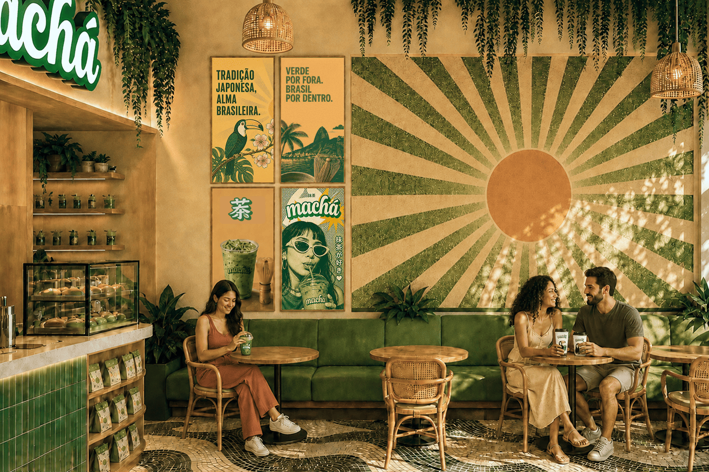
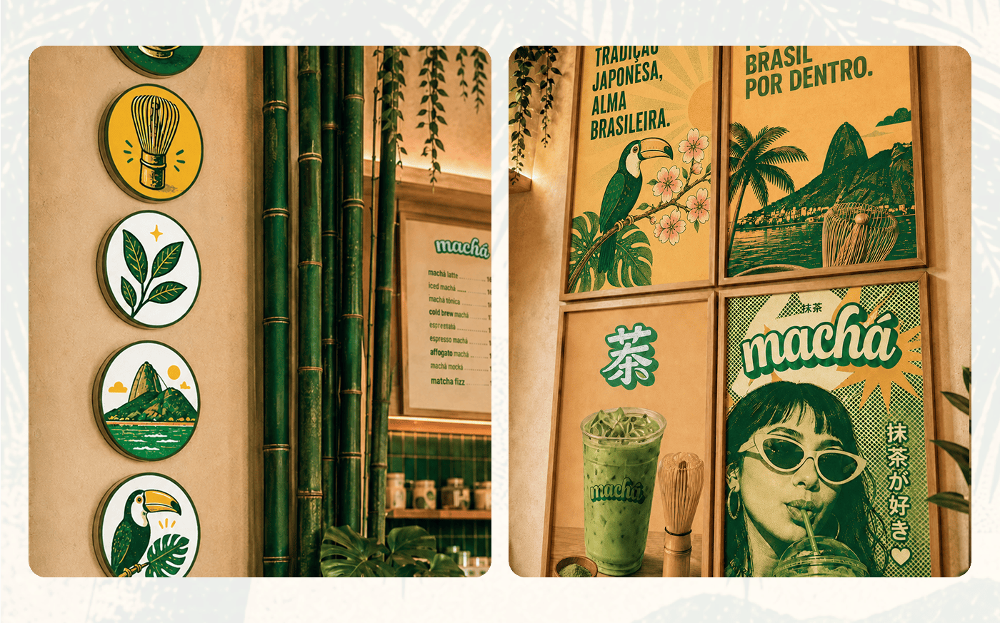
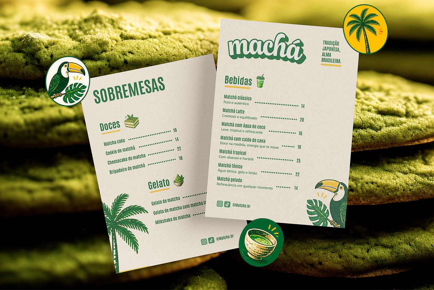
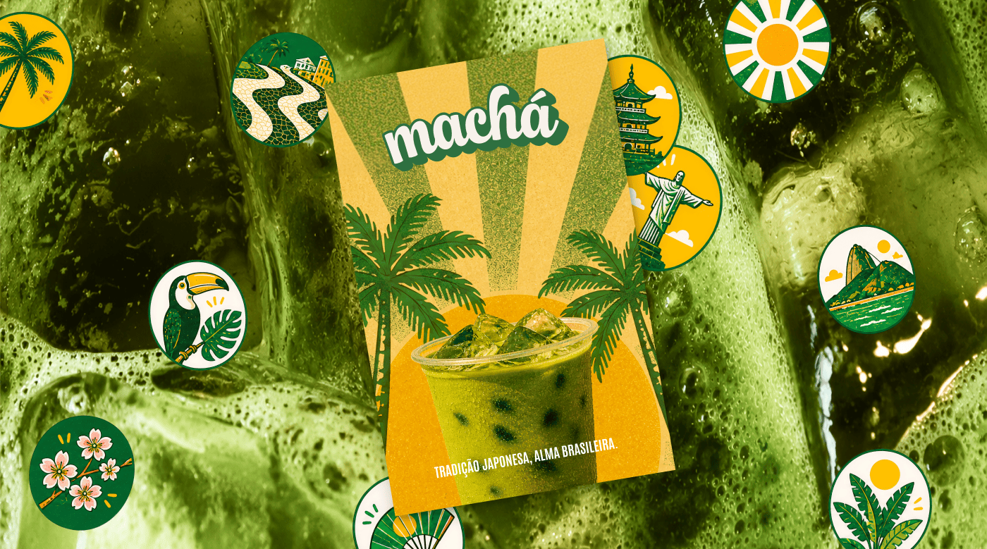
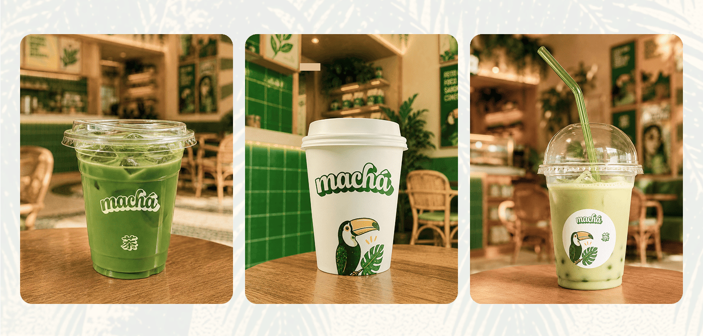
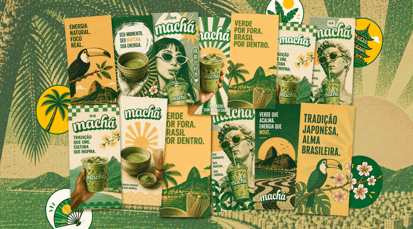
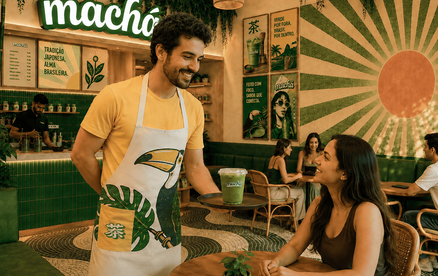
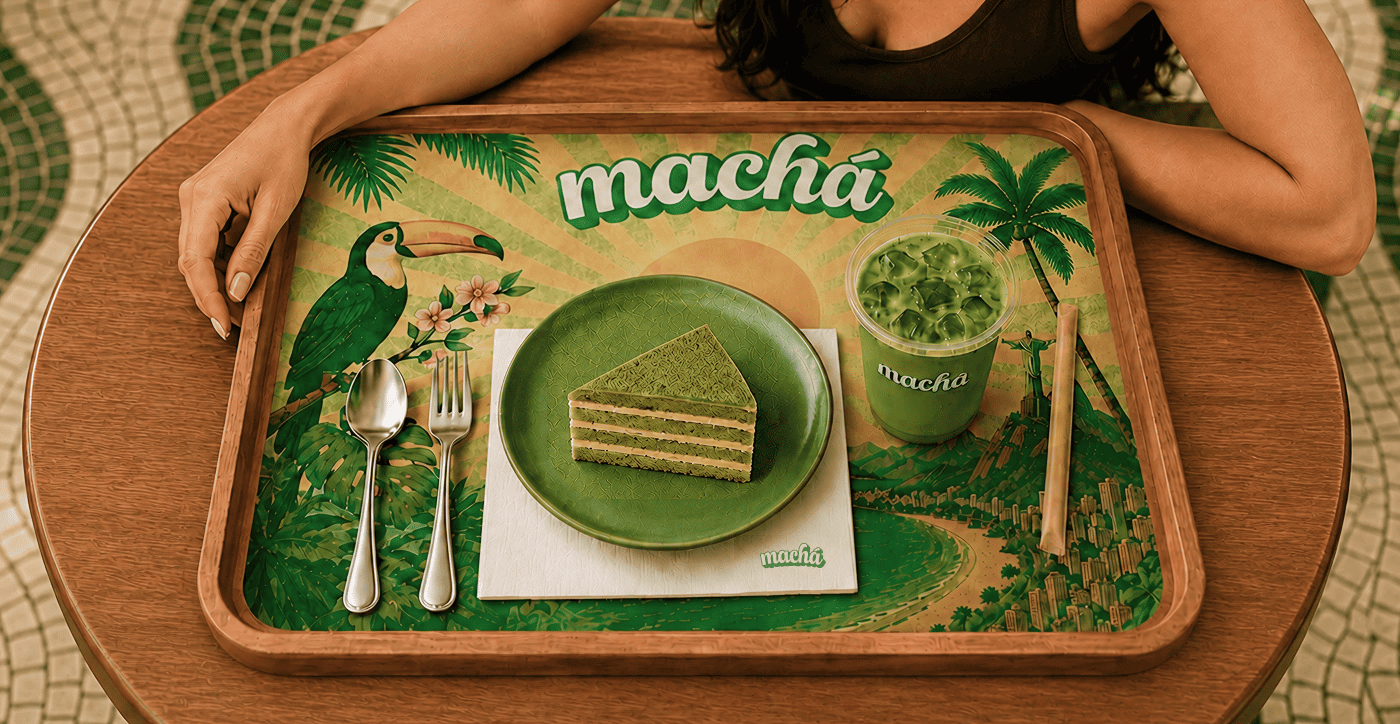
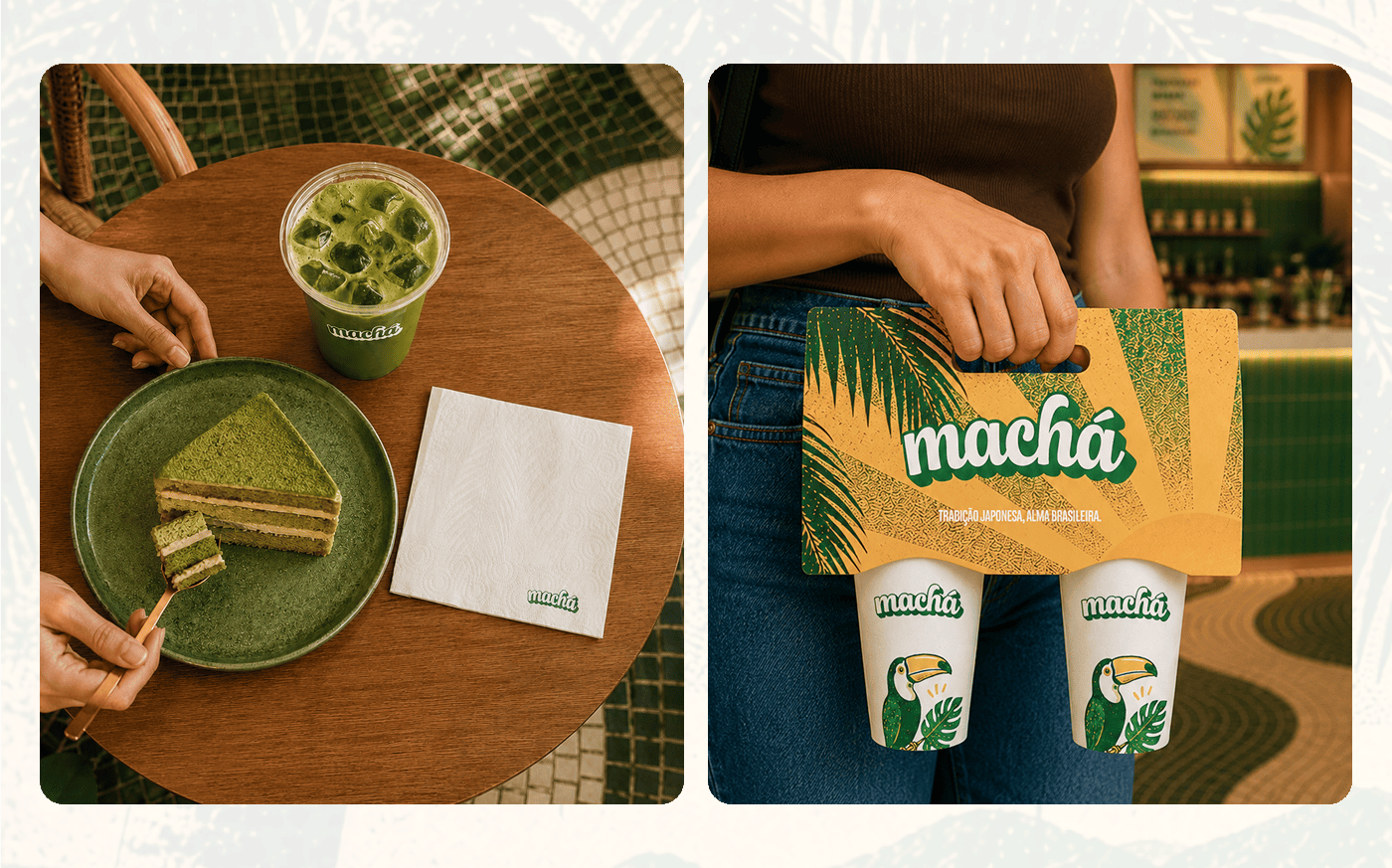
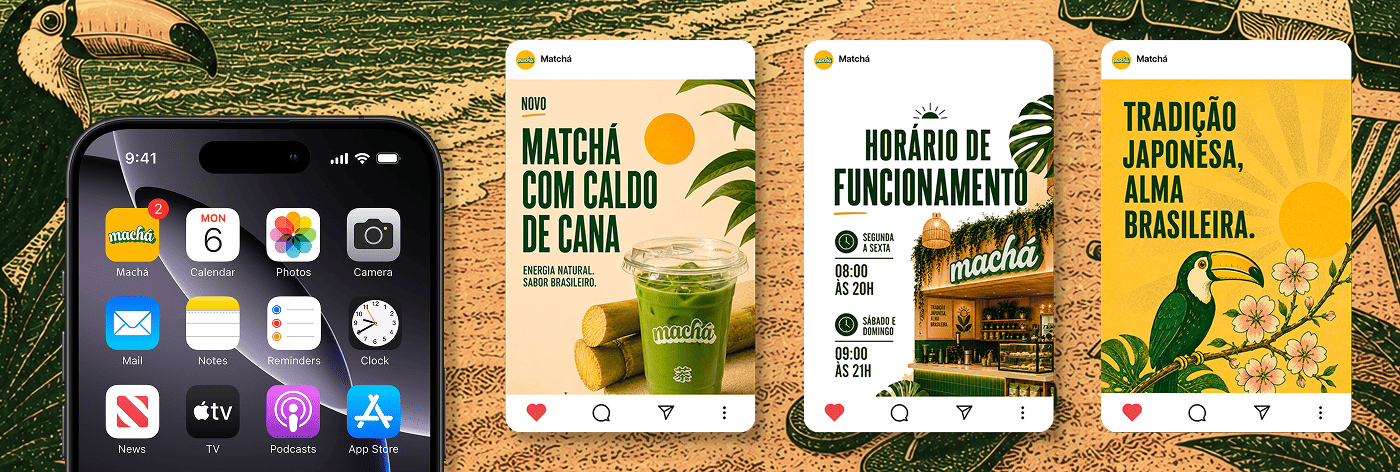
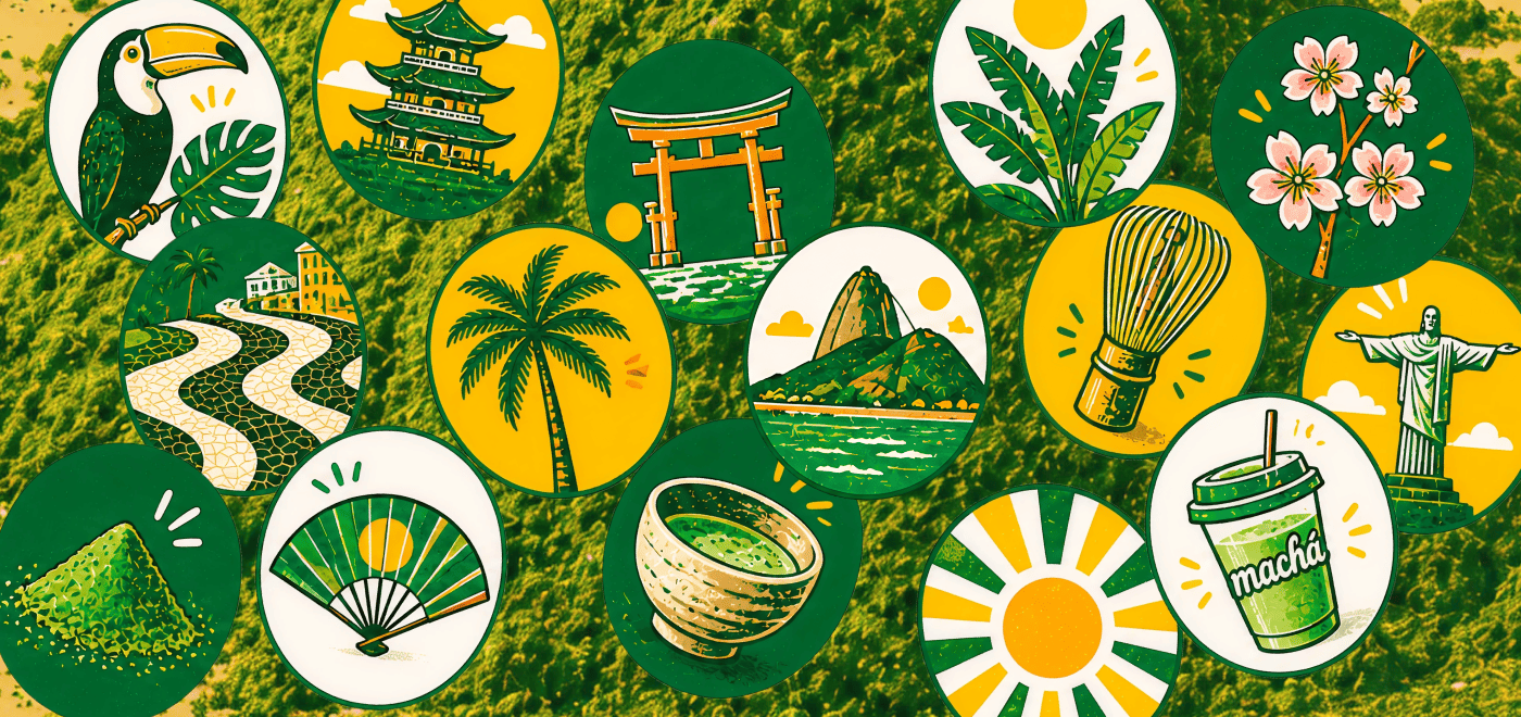
Machá nasce do encontro entre a tradição japonesa do matcha e uma leitura carioca, solar e contemporânea. O projeto busca transformar a bebida em uma experiência visual e cultural, combinando calor tropical, presença gráfica e uma atmosfera inspirada no Rio de Janeiro.
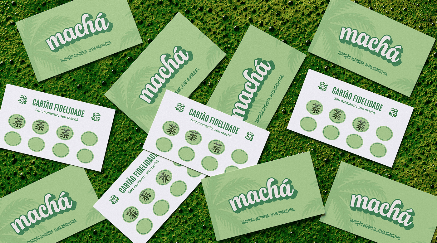
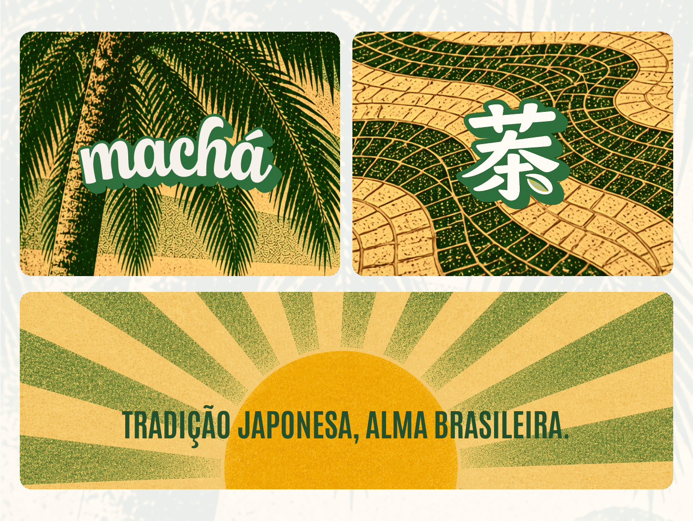
O nome Machá mantém a proximidade sonora com matcha, mas ganha uma escrita mais própria e brasileira. A adaptação reforça a essência da marca: uma identidade que parte da cultura japonesa e encontra no Brasil a sua energia e personalidade.
🇺🇸
Machá is born from the encounter between the Japanese tradition of matcha and a Carioca (Rio de Janeiro) interpretation, sunny and contemporary. The project seeks to transform the drink into a visual and cultural experience, combining tropical warmth, graphic presence, and an atmosphere inspired by Rio de Janeiro.
The name Machá maintains its phonetic similarity to matcha, but gains a more unique and Brazilian spelling. The adaptation reinforces the brand's essence: an identity that stems from Japanese culture and finds its energy and personality in Brazil.


🇧🇷
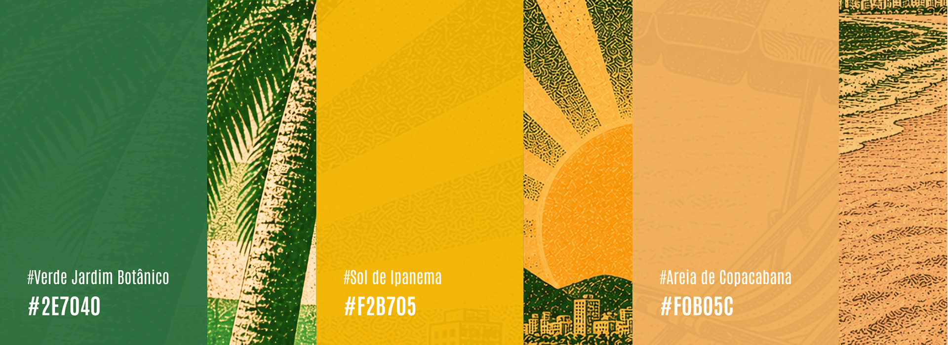
A paleta parte do verde Jardim Botânico, do amarelo Sol de Ipanema e do bege Areia de Copacabana. Juntas, essas cores traduzem o encontro entre matcha, calor tropical e atmosfera carioca, criando uma base vibrante, clara e acolhedora para a marca.
O verde reforça a origem e a matéria-prima, o amarelo traz luz e energia, e o bege ajuda a equilibrar a composição com um respiro mais quente e urbano.
🇺🇸
The palette starts with the green of the Botanical Garden, the yellow of the Ipanema Sun, and the beige of Copacabana Sand. Together, these colors translate the encounter between matcha, tropical warmth, and the Carioca atmosphere, creating a vibrant, bright, and welcoming base for the brand.
The green reinforces the origin and raw material, the yellow brings light and energy, and the beige helps to balance the composition with a warmer, more urban feel.